Deepwater
Giant.
Client.
Stolt Offshore
Sector.
Oil and Gas
Luxembourg
Project.
Naming and Brand
Deliverables.
Name. Strapline. Brand. Corporate Literature. Vessel Specification Sheets. Employee Communication Materials. Electronic Templates. Environmental Design. PowerPoint Template. Safety Handbook. Signage. Stationery. Brand Guidelines. Posters. Uniforms. Global Website. Social Cards. Annual Report. Oil Tanker Design. Digital Assets.
Created.
At BergHind Joseph

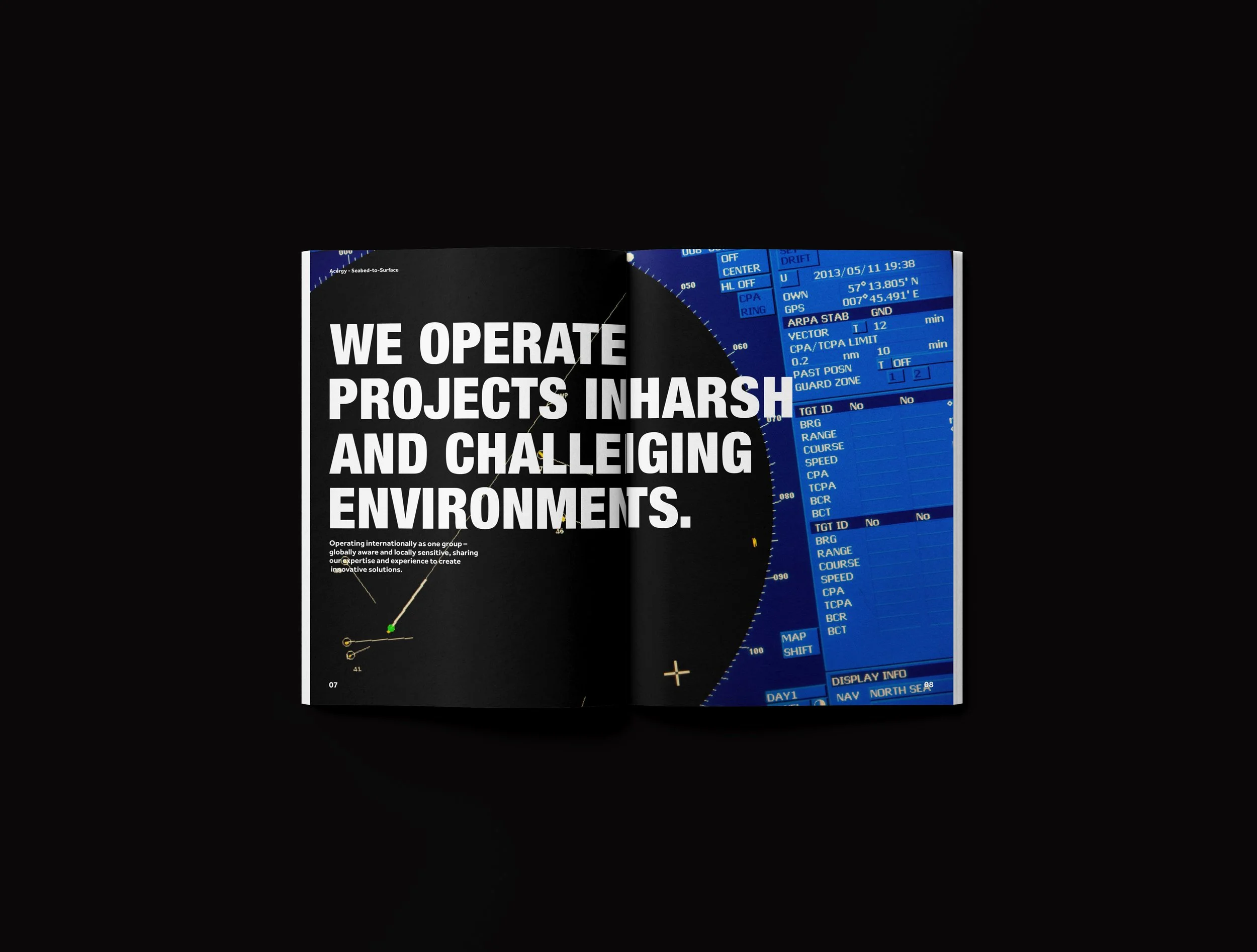
How do you explore the depths of the ocean? By applying space exploration-level technology to dive deeper. Acergy utilises cutting-edge technology, inspired by space exploration, on the seabed.
When a Scandinavian leader in the planning, design, construction, and maintenance of oil and gas extraction facilities demerged from Stolt Offshore, the company turned to us to craft its new brand. Our task was to create a fresh brand name, a global logo, a comprehensive suite of marketing materials, and, for the first time, a clear way to communicate its business to all stakeholders.


The new brand needed to work in a wide variety of environments and at different scales. It needed be bold enough for the hulls of a fleet of vast ships that traverse the world’s oceans but equally at home on corporate stationery, on site and websites. Our research into sea mythology, sea creatures, and energy-related words (to name a few areas) generated almost 200 new name options.


Our client was inspired by the joining of two words to form our approved new name. Combining ‘ace’ (meaning sharp) and ‘-rgy’ (from the word ‘energy’) to form our new name: ‘Acergy’. it suggests excellence in serving the energy industry and has a connotation with oil ‘ascending’ to the sea surface.


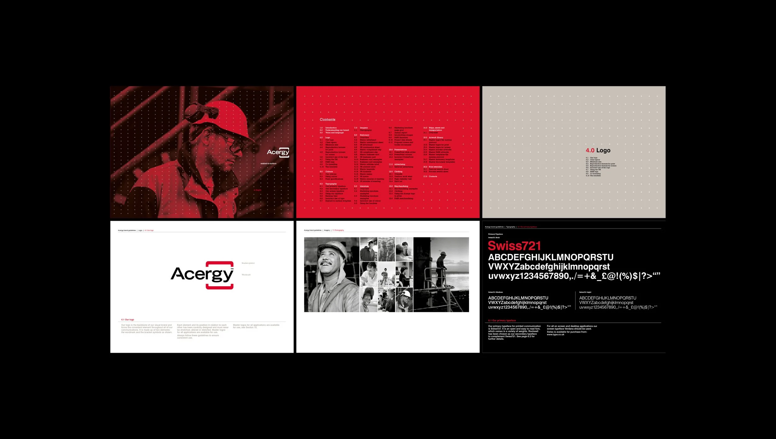
We created a concise, compelling strapline simultaneously to help stakeholders grasp instantly what Acergy is about: ‘seabed-to-surface’. The new logo design focuses on Acergy’s core strength: extraordinary engineering. Sharp edges retain a masculine, engineering brand personality. A distinctive new look and feel for the company’s collaterals was crafted by introducing dramatic images of the sea and a limited colour palette of red, black and grey. Each design element tells the story of Acergy’s harsh but fascinating working environment.


Acergy has been reinvented. The full story of its incredible work is conveyed through bold imagery, dramatic use of colour, a powerful new name and succinct copy written in the technical language the company uses every day. And I'm proud that my brand traverses the world’s oceans on the sides of vast ships.